This is the first video scenario of Walkabout. Some of the behaviors are still incomplete, but that's the focus of work at this stage. Refine is the word!
This week as the graphic explorations are becoming more concrete, I started adding the behaviors and trying the Walkabout service in motion. The first try resulted in the video above. Incomplete as it is, I could get important feedback from it, regarding the transitions when the user turns direction.
This movement of turning has range, could be a wrist motion, an elbow motion or even a shoulder or torso motion. I want now to run a quick test with users to observe this detail and refine the transition accordingly. Users regarded the Walkabout interface as being too serious, and looking more as a professional tool than a playful service that should be used in the spare time. I guess that I was imposing my own aesthetic values upon the interface and the refinement is bringing it to a more appropriate configuration to the purpose of Walkabout.
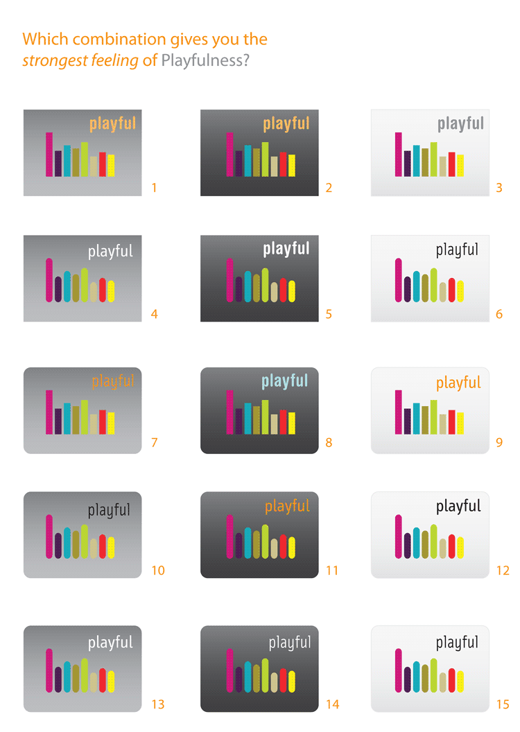
I ran a quick user test and research on the web to find out the elements that can sense playfulness. I wanted to find
out what are the criteria behind the choices, not which combination I should use in the project. I found that roundness
beats sharpness by far, but the dark background had some interesting votes, being associated to cartoon and because
the colors stand out more. One user replied that to him, the light background, to his kids, the dark one. The gray
background didn't get any votes.
The most curious decision came to be between lightness or boldness, represented in the study by the text. In the samples
12 and 15, the only difference is the typeface.
An equal number of people picked each of them, some arguing that playfulness comes from lightness, from being free
and moveable. Some others argued that playfulness comes from a sturdy robust and break-free shape, that is soft and
you can mess around with harmlessly.
My conclusion is that they are both right, it's a matter of choice, context and being appropriate to the project.
On the web I looked for the most famous Video Game consoles to see how they solved the same problem of graphically
inviting users to play. Curiously Nintendo Wii, Sony Playstation and Microsoft XBox use the three profiles I selected, each
one going in one direction. The common elements would be contrasting vibrating colors and roundness, but a different
radius to each one of them. I understood that the bigger the radius the more friendly.
This research also confirms the apropriateness and what degree of friendlyness the service should convey. Playful can
have several faces.


Finally I have done some work with the companion website of the service, trying
to establish a common language with the mobile interface and incorporating the
more playful profile.

City homepage, before the user logs In.
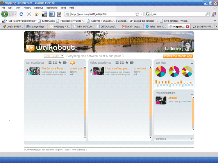
User page, with the list of experiences, data, contacts and recommendations.

User page, showing the contacts panel expanded and data and recommendations closed.
The website as well as the mobile interface has been going a long way with many hours spent on finding the right elements
and the right language. See some examples of the wireframe and the previous, more serious version.


Some Graphic Chaos to finish the post. = )