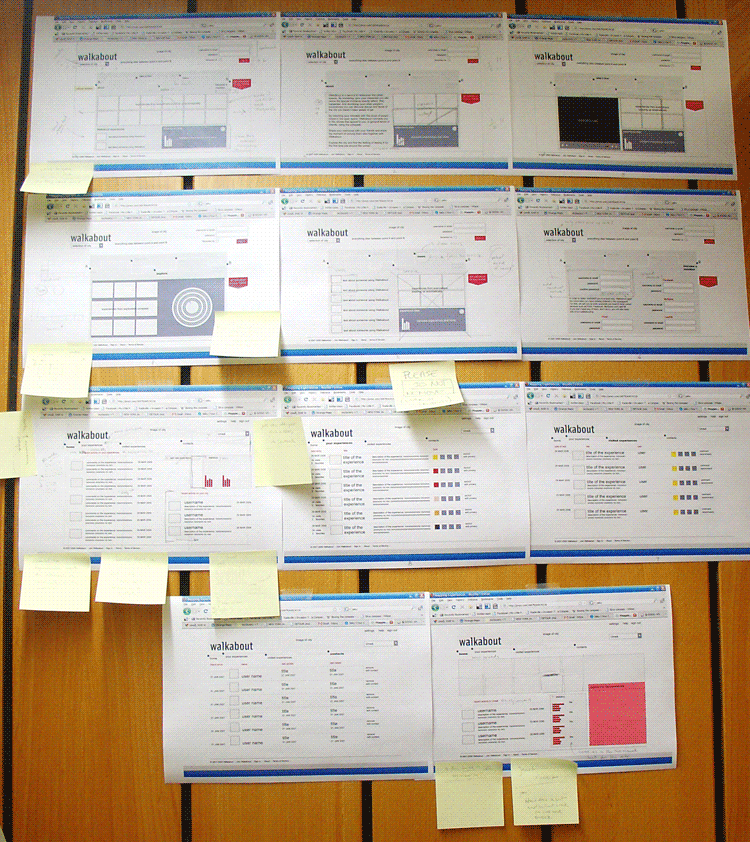
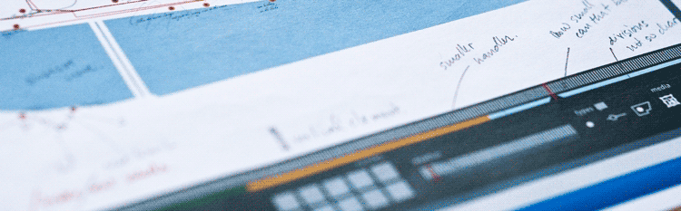
Getting the interface on paper
In the past week I followed a suggestion by Rahul and started playing with the interface elements, getting things on
paper and also on illustrator. It might be getting ahead of schedule, but it turned out an excellent exercise, bringing
different concerns and getting a bit away from data and its meaning to how to show this data, manipulate it and the
possible metaphors to use.

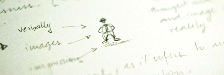
Visual dialogue
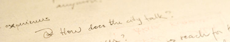
Doing something and having it printed worked in two different ways: one more practical that is taking the ideas out of
the brain and thus establishing a visual dialogue with the project. It's easier for me to criticise and evolve the ideas
once they are outside my head.
In another direction, getting something printed gave the sensation of doing something, of getting more concrete and
moving forward. This is similar to the sensation we had as a class during the introduction to ethnography project here
in Umeå. The question "when will we start designing" still persists although I can rationally understand that the collection
and selection of data, things I have been doing so far is also designing.
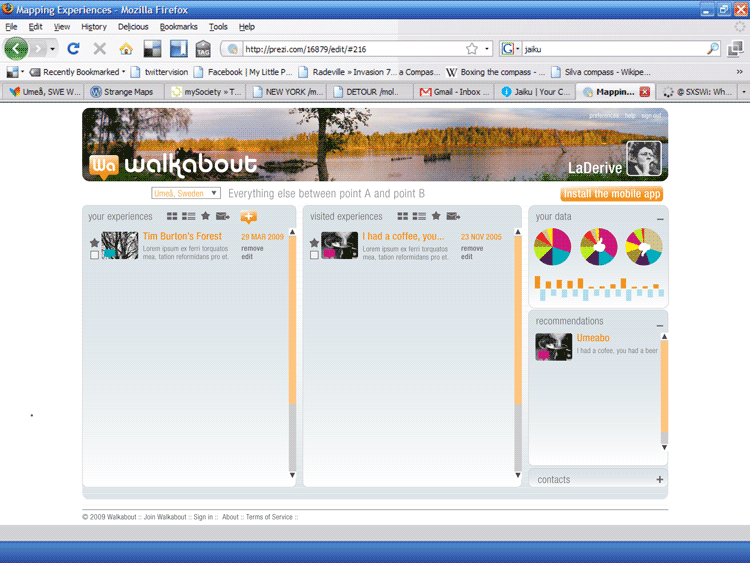
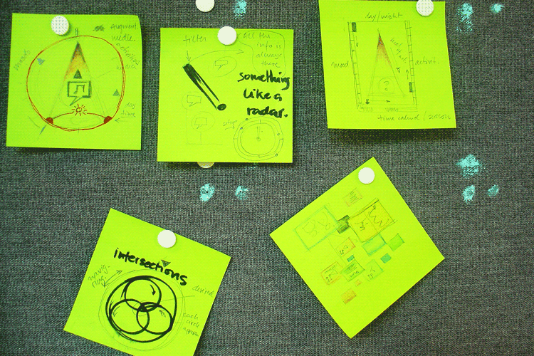
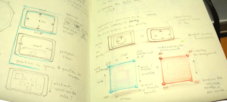
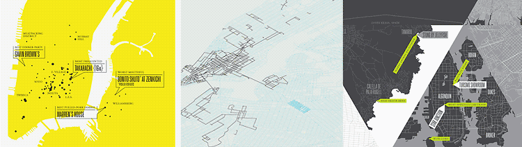
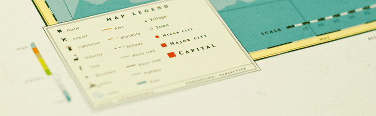
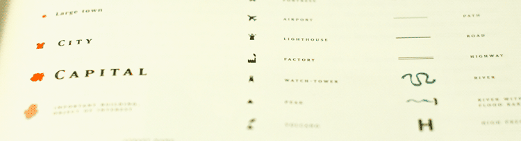
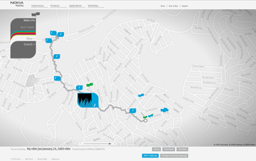
First concepts
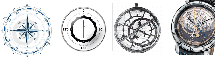
In this first attempt to create the interface, my intention is to play with the familiar and the unfamiliar, coming close to
a an ordinary map in its appearance but still displaying some out of the ordinary content. Escaping the "default" modus
operandi as Brendan Dawes describes so well in his book Analog In, Digital Out.

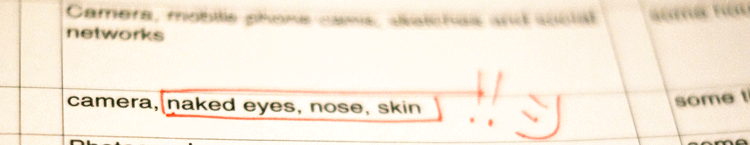
My first idea was to play with the concept of the legend, make it interactive and slightly strange in a closer look. Still
this is only one of the possibilities, and also to be developed further.
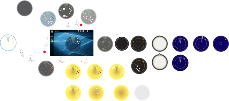
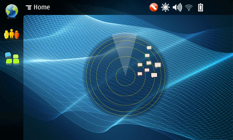
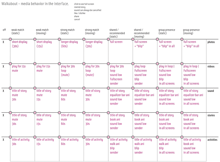
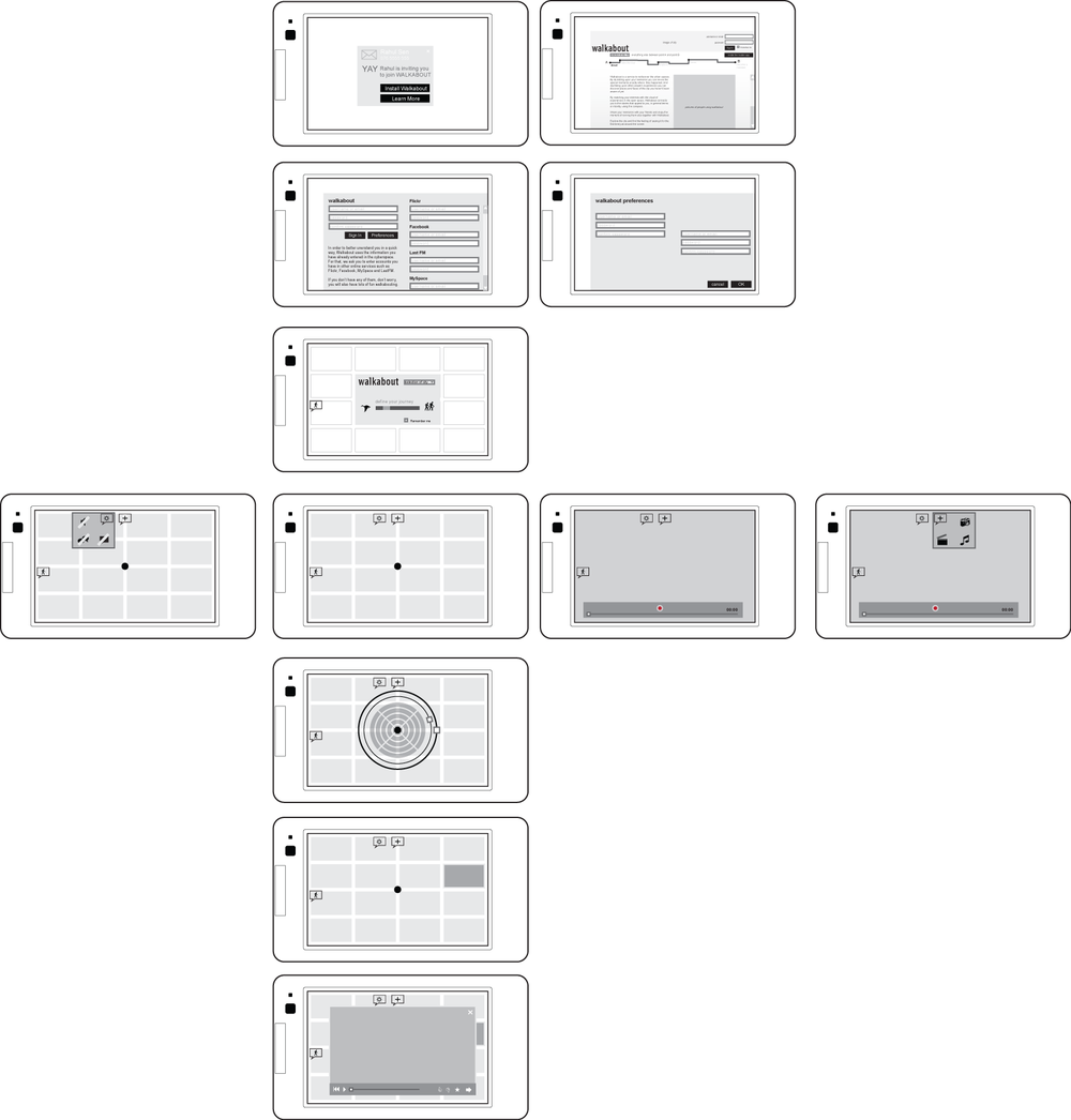
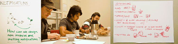
Stumbling on data
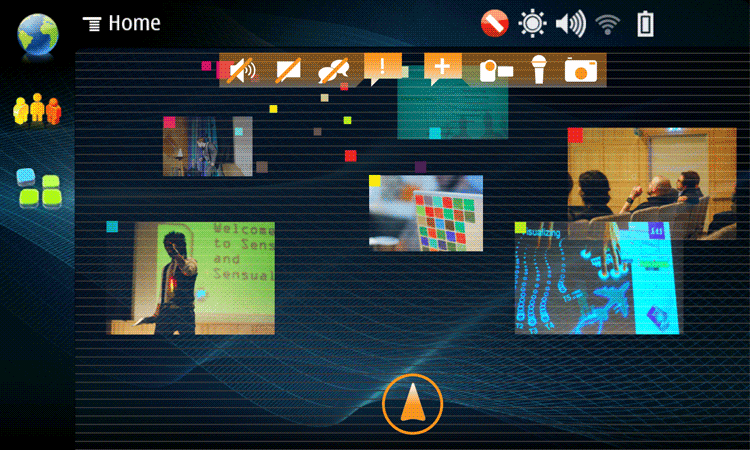
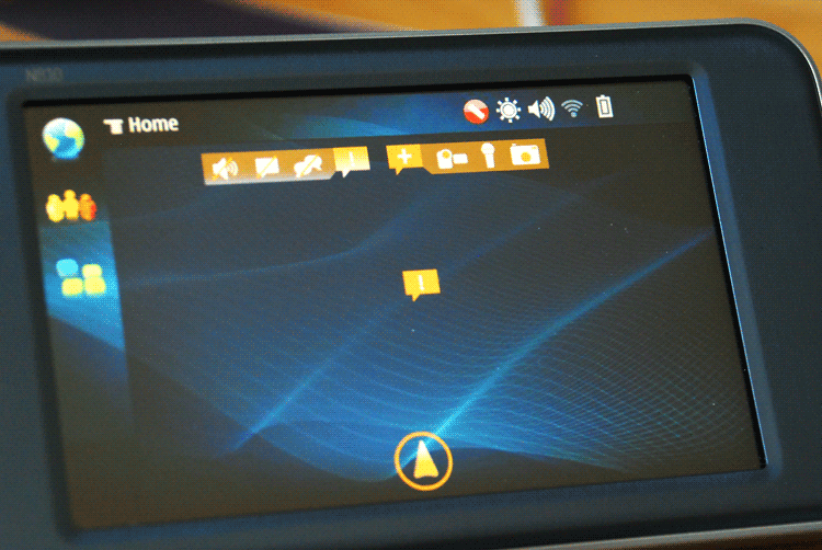
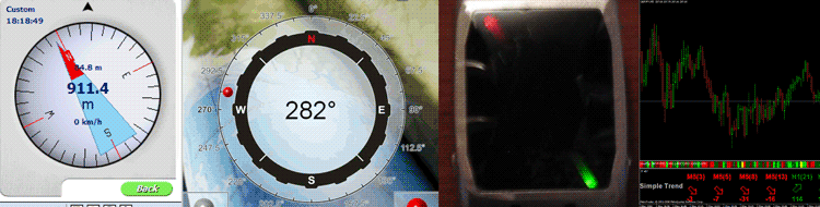
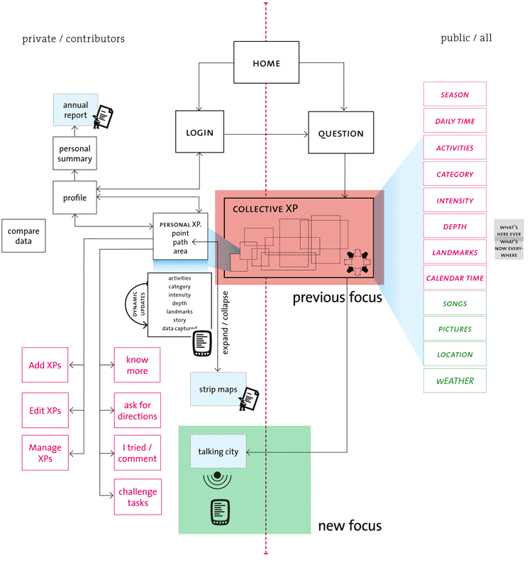
In addition to this, I decided to focus more on what goes on with the mobile device, to explore in more detail the
interactions that happen when people will actually stumble across the digital annotations in space. I developed further
the information architecture in that direction and found there are three main points in this branch of the project:
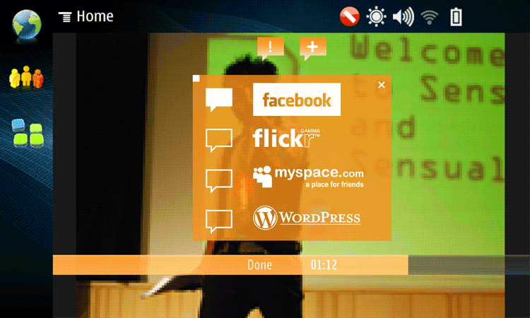
1 Dealing with the notifications that will alert people of when there's something interesting for them in the vicinity;
2 Defining the filters and how the information will match people's intentions and feelings at every moment;
3 Creating the invitations to engage people in following the information and also the activities proposed by other
community members.
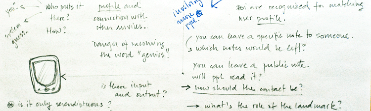
Each one of these topics could be a project in itself. I decided that the filters are definitely out of the question as a direction,
for it falls out of my reach and interest.

But both the invitations and the notifications are very interesting topics to deal with. In the next weeks I should try to explore
them in interactive low-fi ways. Just experimenting with how people react to public invitations and how annoyed they might
be by notifications and how to make them more peripherical but still noticeable.
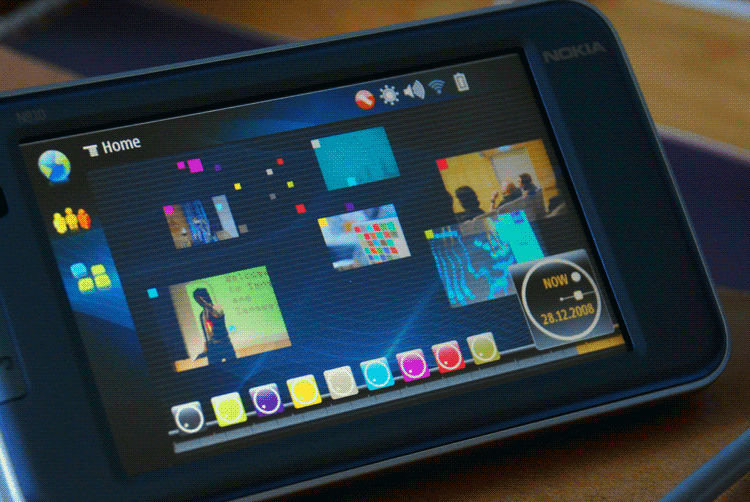
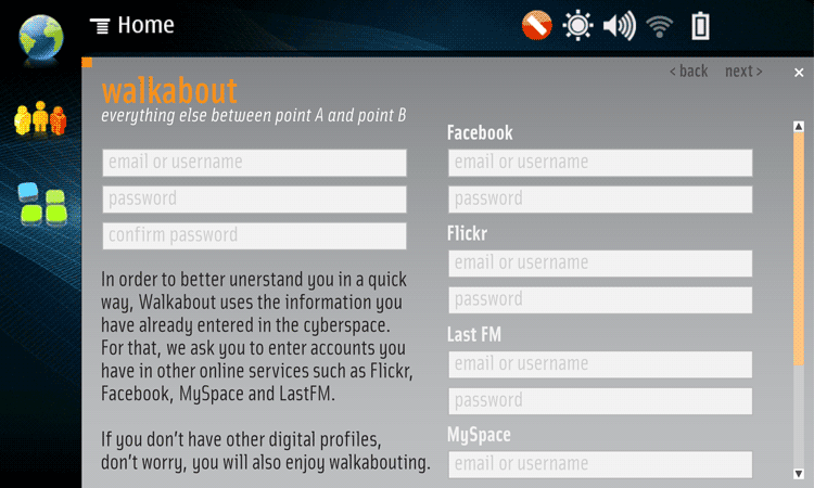
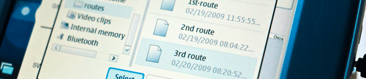
Gettting a device and making it work
In a different direction I got a Nokia n810 and I have been looking for different applications to try to get its internal GPS data
to another application such as Flash or Flash lite. I found direct ways to do it if it was running the S60 platform, but instead
this tablet runs on Maemo linux, so it's a bit more complicated for someone with zero experience in Linux. There is always a
library of something missing and I didn't progress so much although I have been looking in Forums and downloading loads of
new stuff.

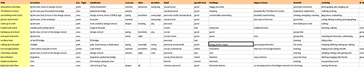
Sleepwalking GPS
But I got one application working and been walking around everywhere with the GPS on now, just playing with the tracking
feature so that I can map my own walks. The funny fact is that after the first day I got this working I came home and found
that by the window the satelite signal was still strong, so I left the device on during the night standing there by the window.
In the next morning there was a cloud of dots and long threads of track going all the way to the river, past the design
school. I wonder if GPSs sleepwalk.

Feedback from Mattias
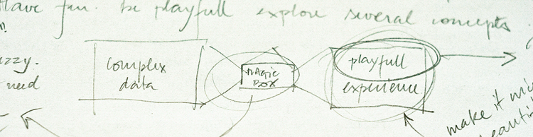
On thursday I had a review with Mattias Andersson, our tutor for the project and the talk went pretty well. He pointed
the direction of a playful knowledge, based on a nice experience of the content I gathered through an inspired interface.
The effort of putting an interface to paper was also praised, but I should take some steps back and explore more before
committing so much to one concept or one idea.
Exploring other ways
So I took a step back and started to think about different approaches to the experiences I collected. Different ways to
interact with them and to involve all the different aspects in a whole experience. One idea that came to me is the Moleskine,
the classic black leather notebooks used my the common and the celebrities to document their experiences. I would like
my project to be kind of a digital moleskine, that has a private and also a shared side.


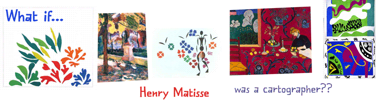
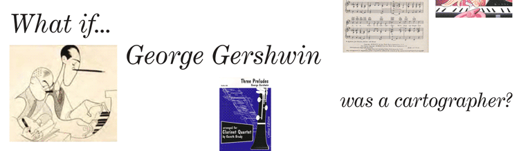
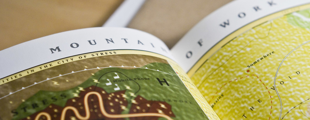
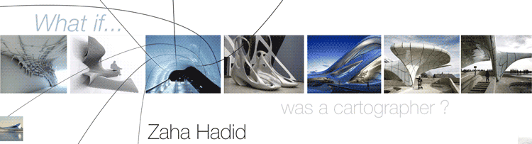
Another experimental direction is to think what if Zaha Hadid, the famous architect was a cartographer. In her works,
the force lines and flow are always expressed in the design, so I feel like there are similarities that could be explored.
And still I like the idea of playing with tha familiarity of maps and legends, trying to play with these aspects in the way of
interacting with the information. After browsing through "Analog in, Digital out" I started to reflect more on the analog
ways of dealing with maps and globes to insert in the interface.

Analog In, Digital Out. By Brendan Dawes.
Mapping Time and Space, how medieval mapmakers viewed their world. By Evelyn Edson
Google Maps Hacks. By Rich Gibson and Schuyler Erle.

Mapping Hacks